How We Helped an Industry Leader Rise Above the Imitators on Amazon
What You Need to Know
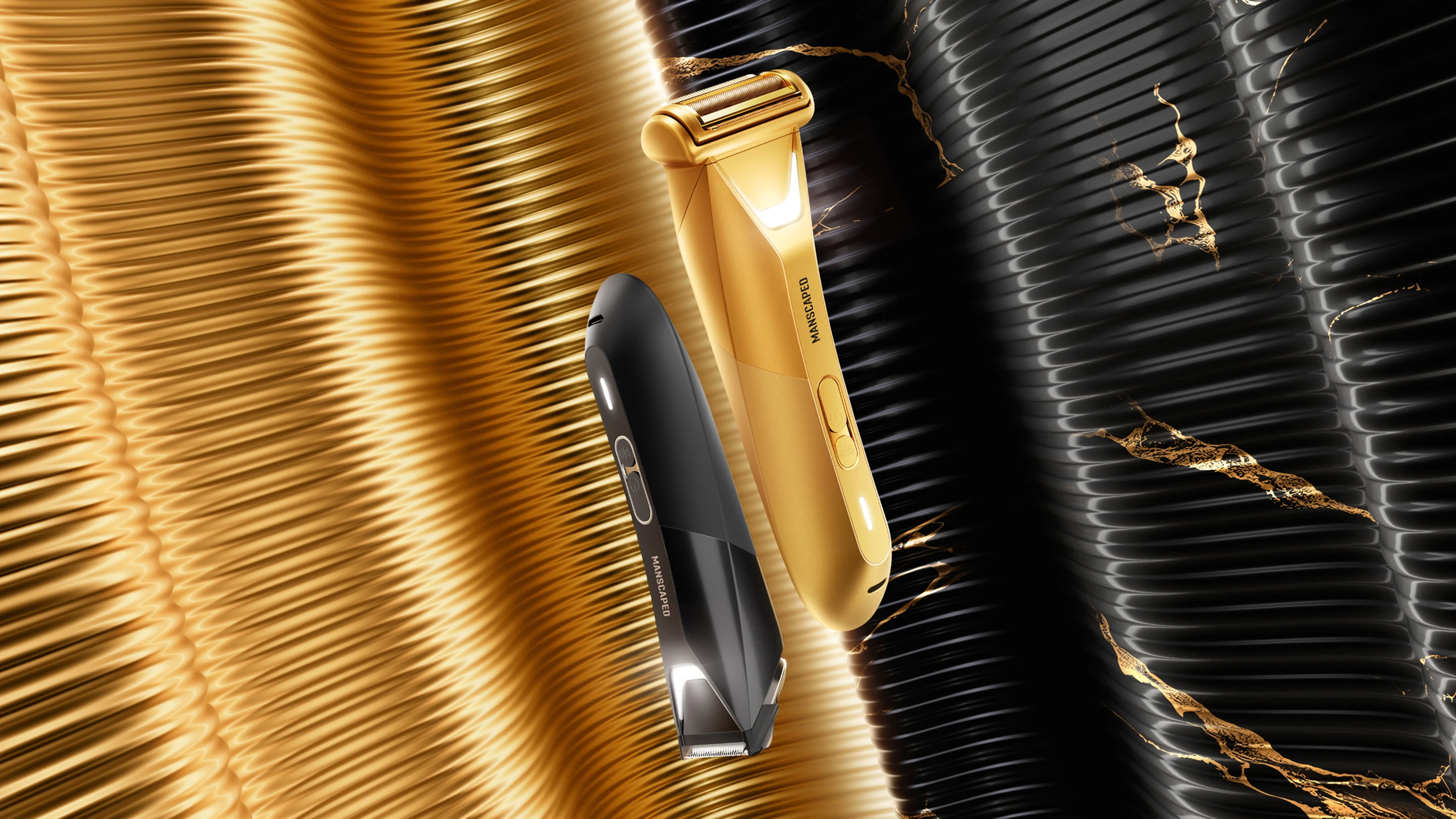
When MANSCAPED launched in 2016, they didn’t just join the men’s grooming space—they completely redefined it by introducing a whole new category focused on below-the-belt grooming. Since then, they’ve expanded their lineup and continued to lead with an unconventional, bold approach. And naturally, the copycats started springing up. Over the past few years, competitors—especially on Amazon—started imitating their style, making it harder for shoppers to spot the real deal.
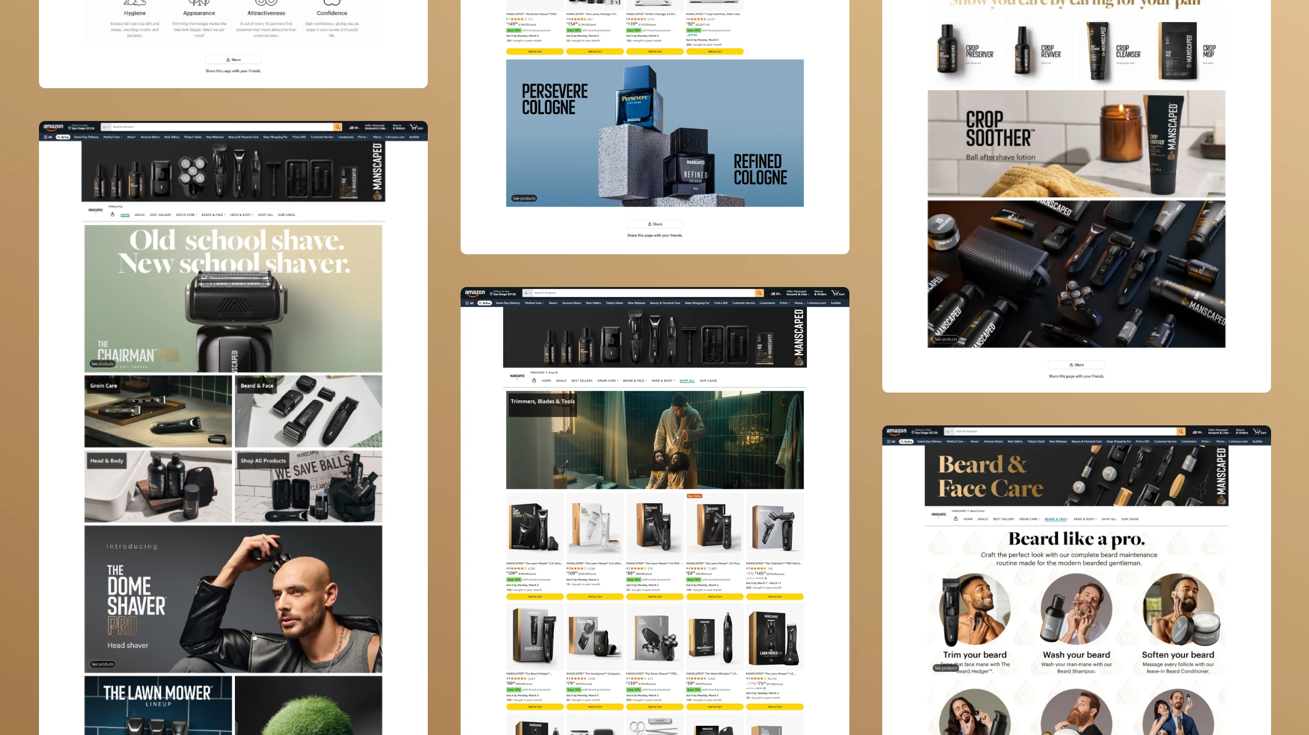
Close to 70 products on the old storefront.
The Challenge
As more and more grooming products on Amazon started to cop MANSCAPED's look, standing out became a real challenge. Refreshing the product imagery seemed pretty straightforward—but the more we dug into the details, the more we realized how important strategy was.
First, the range of products. With nearly 70 products to update, we needed a scalable system that worked with everything from a flagship trimmer to a shave gel.
Second, timing. Our schedule put us right up against key shopping events—Amazon Prime Day, Black Friday, Cyber Monday.
Third, requirements. Amazon’s storefront has its own unique set of do’s and don’ts. We had to not only learn them, but figure out smart ways to work within (and sometimes around) them to make MANSCAPED stand out.
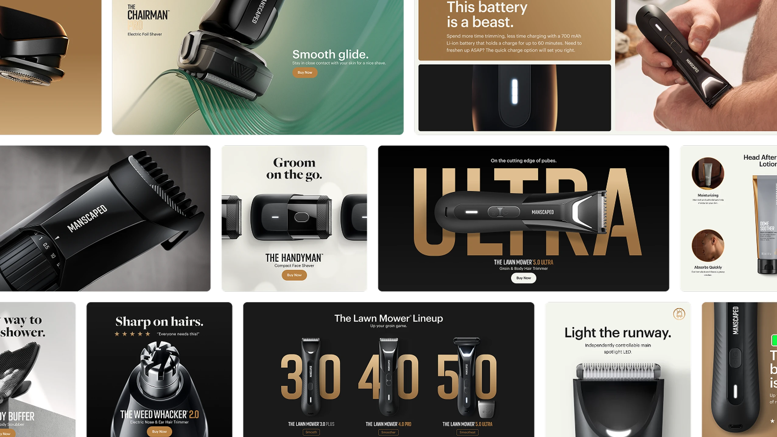
Time to Design
What looked like a straightforward task quickly turned into a carefully orchestrated operation. We needed to create a storefront that would rise above the Amazon clutter with a bold, unmistakable point of view.
Working closely with the MANSCAPED team we explored ways to stand out, while staying true to the brand. Those sessions proved invaluable helping us distill the essence of what would become a cleaner, more elevated storefront.
Rather than cramming features into every available space, we developed a design language that let products breathe like mini billboards, each with its own space to shine while maintaining harmony across the lineup. The team moved beyond simple feature lists and specs, in favor of highlighting benefits that connected directly with shoppers' needs – after all, "Titanium Coated Razor" sounds impressive, but customers care more about things like keeping their prized possessions nick-free.
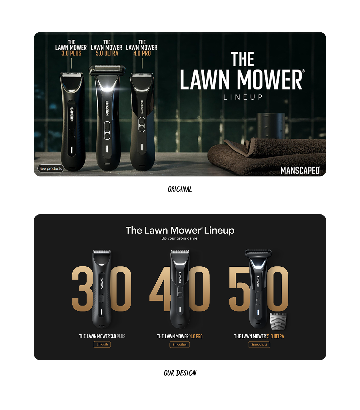
Clean and focused.
With the sheer amount of products at any given page, we reduced visual clutter by using isolated product shots.
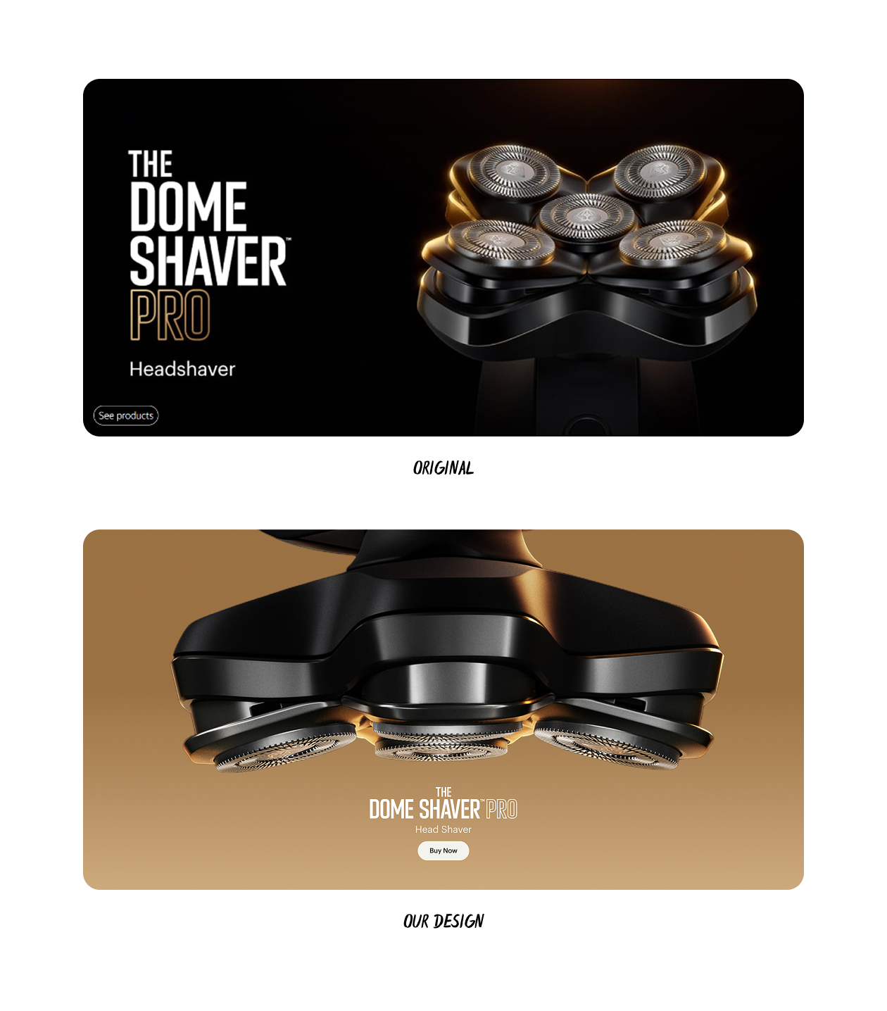
Bold Statements.
We let MANSCAPED’s products do the talking. Up close shots of their products helped communicate their engineering without saying much.
Nay, to simple feature lists. Yay, to real talk.
Proving Ourselves, Again
Through persistent iteration and close collaboration with the client, we crafted a solution that showcased MANSCAPED's premium quality in a way they could truly own demonstrating design does indeed matter.
It's easy to call a project a success, but without numbers, that's all it is - just a claim. Instead, Amazon shoppers showed us just how valuable the new storefront design was for MANSCAPED.
A Smooth Delivery
Following the success of its Amazon storefront, MANSCAPED decided to go big. What started as a single storefront quickly grew into a global presence: 1,150+ assets across 20 stores, 4 countries, and 3 languages. Behind it all was a flexible design approach, built to adapt at scale and ensure the brand was impossible to miss—and impossible to ignore.
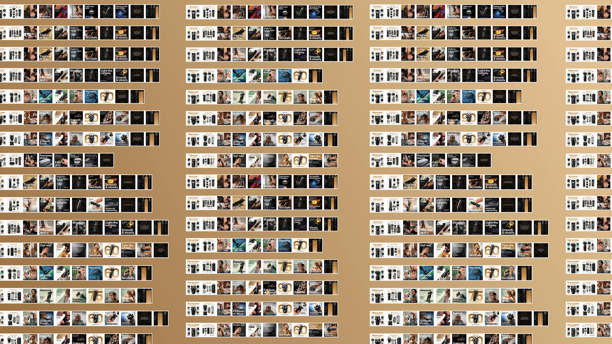
1,150+ Assets 😱
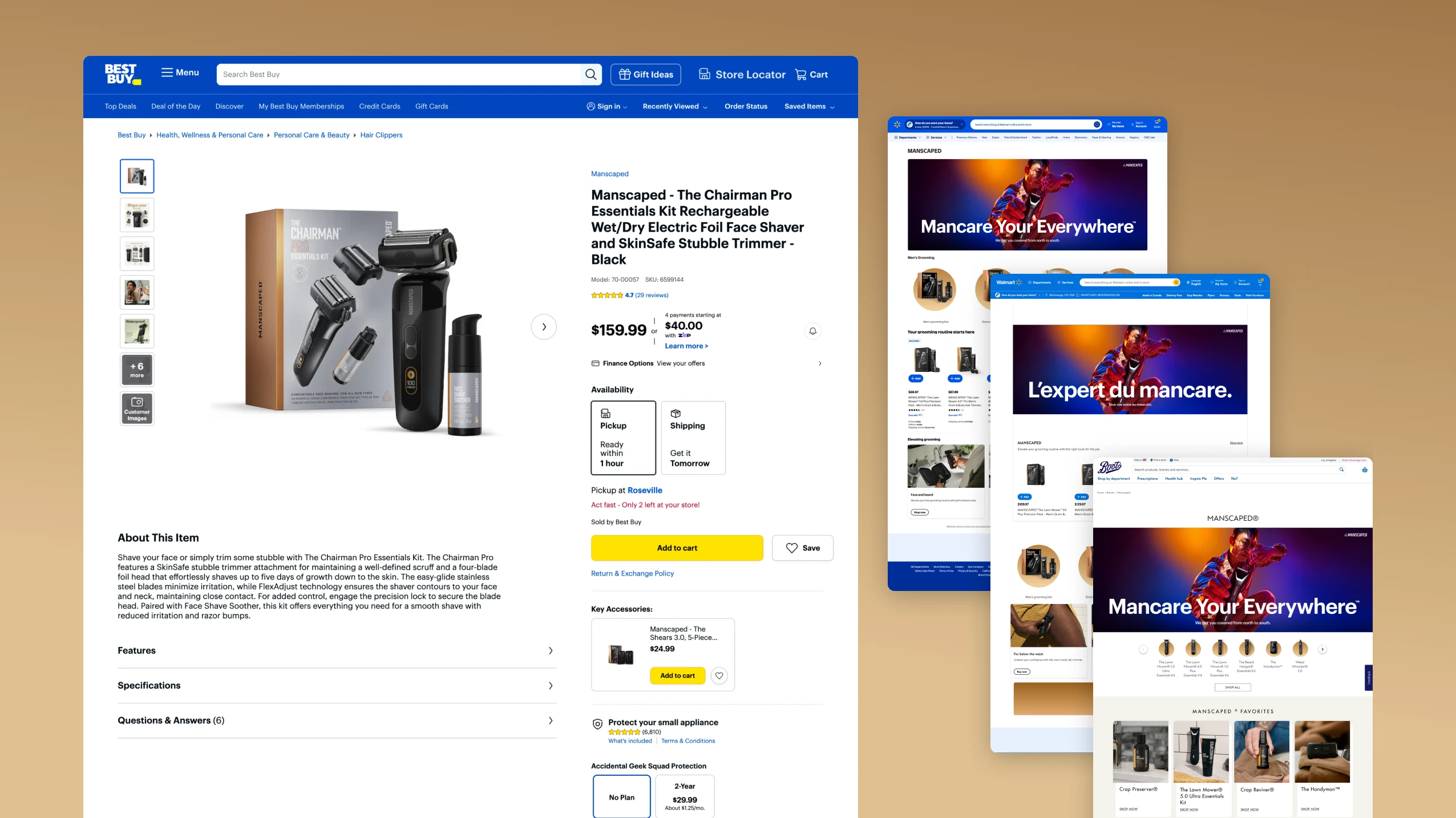
OUT in the wild
We supported 20 different retail brands across the US, uk, Canada, Germany, france and australia.
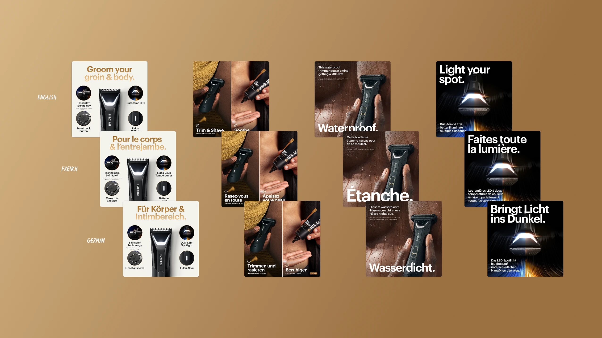
3 different languages


