Welcome

How Research and Design Come Together to Boost Sales

What We Did
MANSCAPED is a bold brand that’s hard to ignore. Since launching in 2016, they’ve pioneered the men’s grooming product category with over 70 razors, trimmers, and skincare products. But that robust product catalog, along with a subscription / loyalty program, led to a lot of confusion on their Product Detail Pages. We dug into the situation, understood their goals, researched their customers, and conducted countless user tests to craft an experience that gave shoppers the clarity they were looking for while giving MANSCAPED the improved conversion rates they wanted.
“We consider the Five & Done team part of the MANSCAPED family — talented, reliable partners we trust to uphold our aesthetic at every touchpoint. Their thoughtful approach blends smart design with strategic thinking and user testing, helping us deliver strong, customer-first experiences that perform.”
Vice President, Global Direct-to-Consumer, MANSCAPED
Understanding The Problem
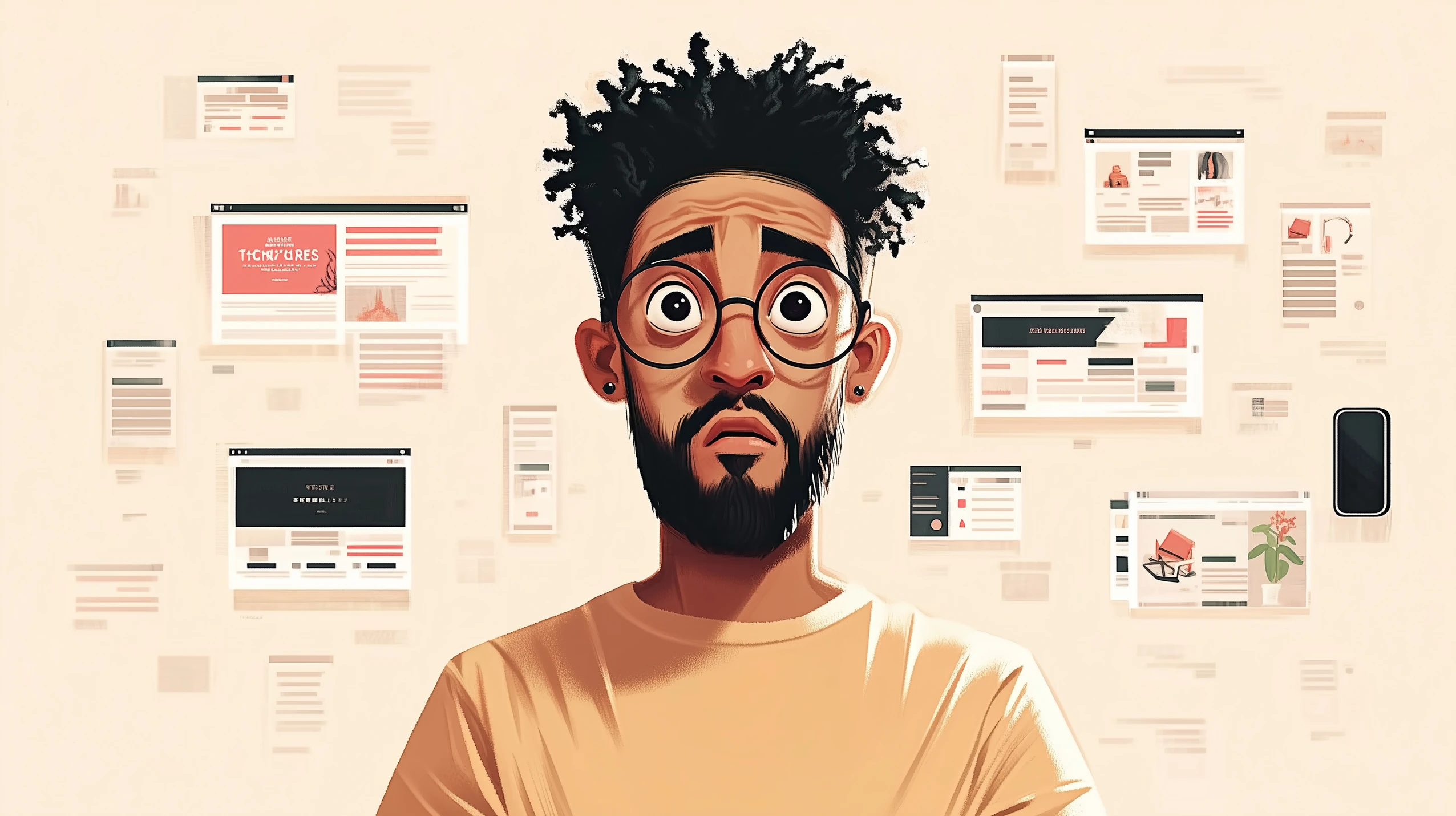
At its core, this is a story about how shopper interviews and user testing helped us evolve MANSCAPED’s product pages from “it’s too confusing” to “makes me really want to buy it”.
From our first round of user testing, we discovered the same four issues eroding confidence and limiting purchases:
Too Many Options and Add-ons
“Yeah it's too confusing, I just want a beard trimmer. don't hit me with all this other stuff. I don’t like it.”
- Mike
Misalignment Between Price and Presentation
“While it says it's premium, it doesn't really give off that premium feel. It doesn't show me that this is worth the price tag.”
– Michael
Inauthentic Testimonials
“I don't really trust the testimonials...I assume brands just put the more inflated comments or testimonials in there.”
– Justin
Ambiguous Subscription Plan
“I didn't really understand what the Peak Hygiene Plan was...which is unclear to me if it's a good value.”
– Matthew
Creating a Strategy
Coming out of our research phase, we had a firm grasp on the problem and developed a strategy to improve each challenge. It consisted of three parts:
Part 1
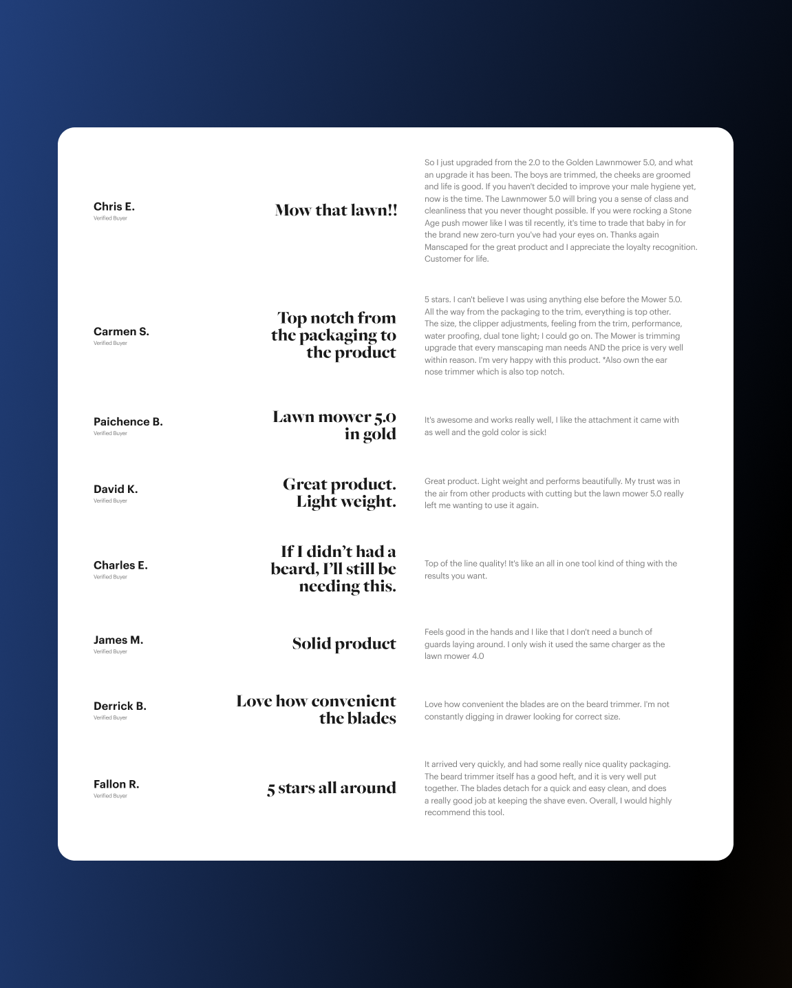
Build Confidence Through Social Proof
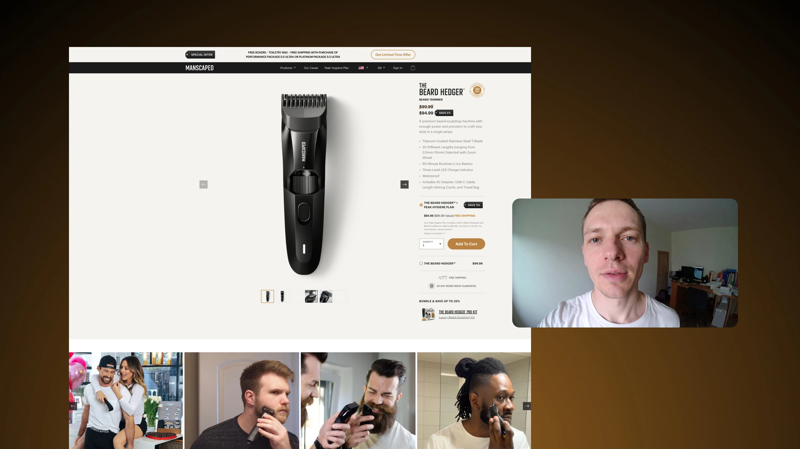
Reviews and testimonials are a de facto expectation in the e-commerce world, but it goes beyond star ratings. We knew from our shopper interviews that people were ignoring the testimonials on the product page, assuming they were curated by the brand and, as one person put it, “kind of useless”. Instead, we leveraged MANSCAPED’s already strong influencer base and brought Instagram and TikTok videos front and center on the product page.
The results were clear. We went from 75% of shoppers thinking the reviews offered “no value” to 70% finding the social media content “valuable, informative, and helpful."
Part 2
Elevate the Shopping Experience
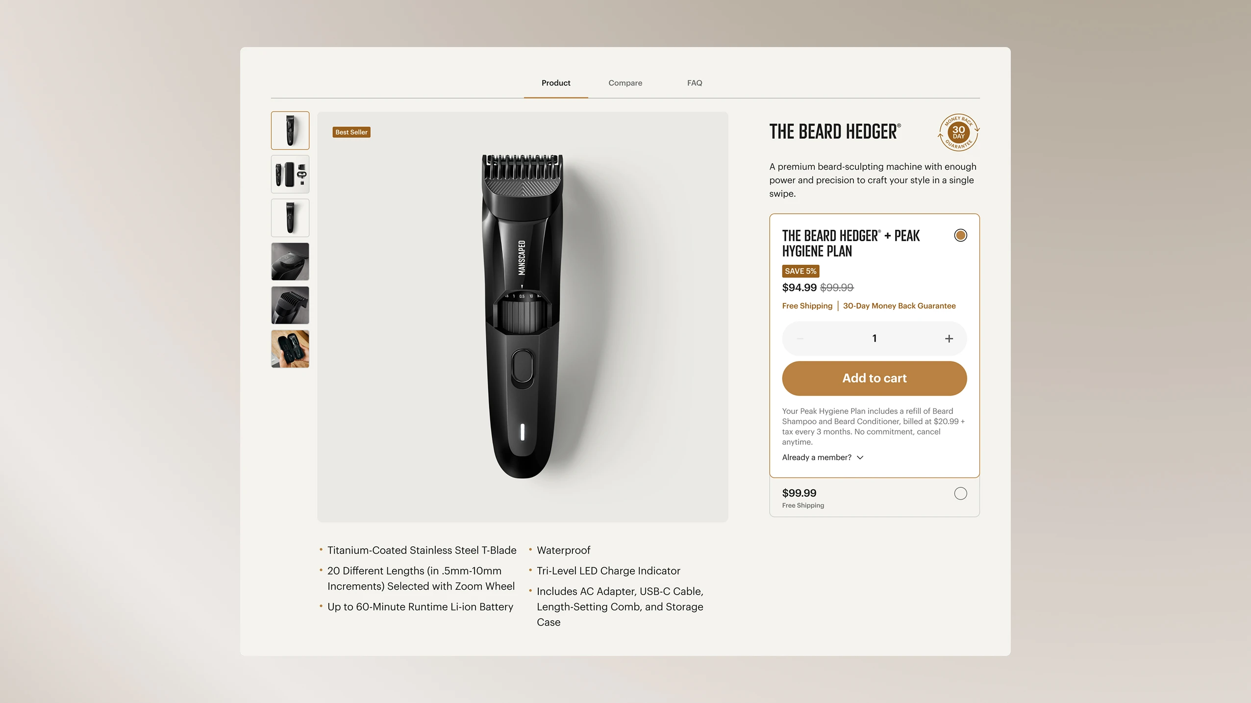
MANSCAPED defined the male grooming category, but inexpensive and white-labeled copycats immediately followed in their path. To stand apart, the Product Detail Page needed to defend MANSCAPED’s premium position by clearly articulating the proprietary engineering and x-factor of its offerings.
Instead, we heard:
To combat these sentiments, we focused on areas that their inexpensive competitors couldn’t match. High resolution imagery and videos showcased the quality materials and finishes of the products. Clear and bold messaging spoke to each product’s category-leading features. And updated layouts and lock-ups felt more premium, while remaining true to the MANSCAPED Brand.
The feedback was clear and immediate:
Part 3
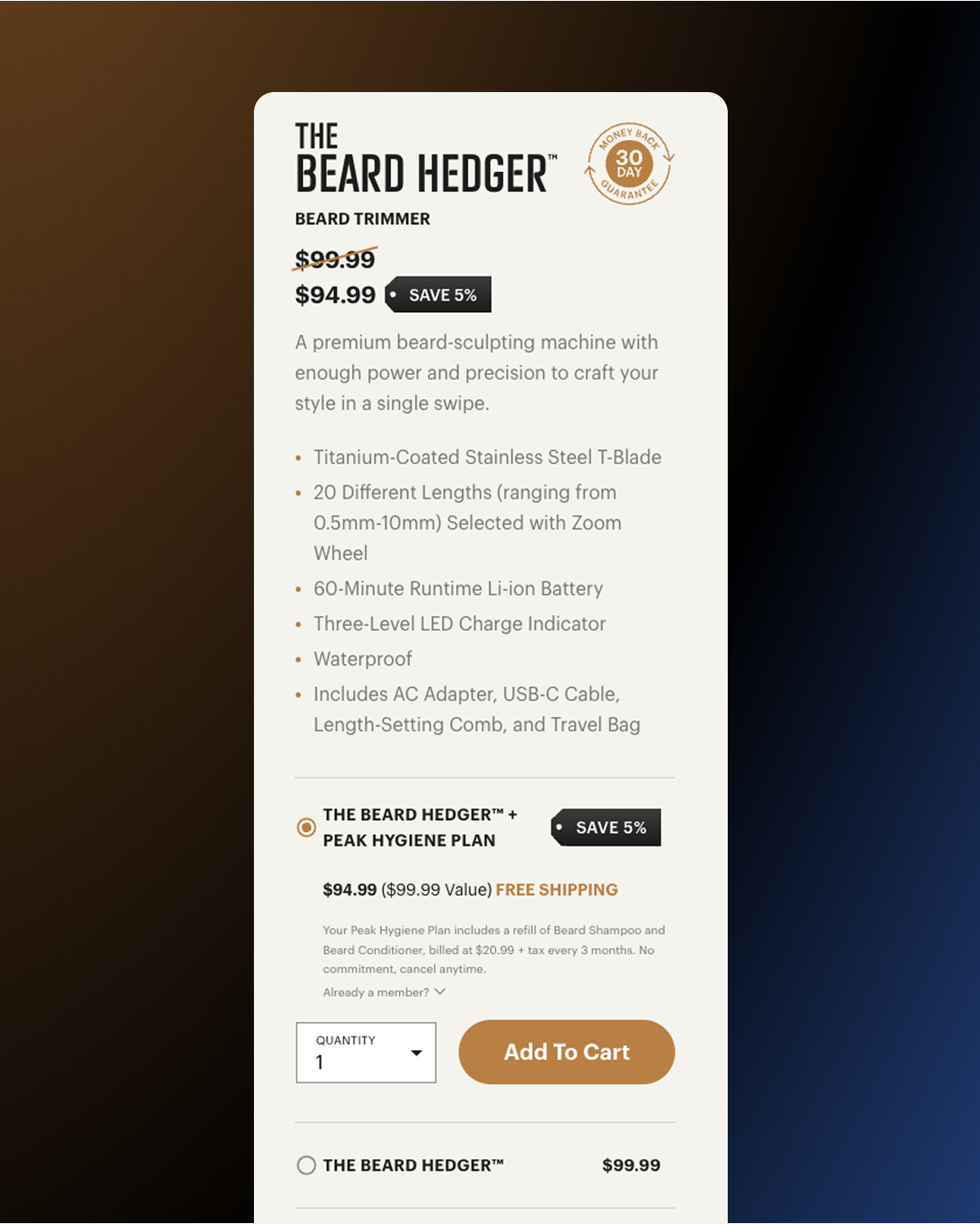
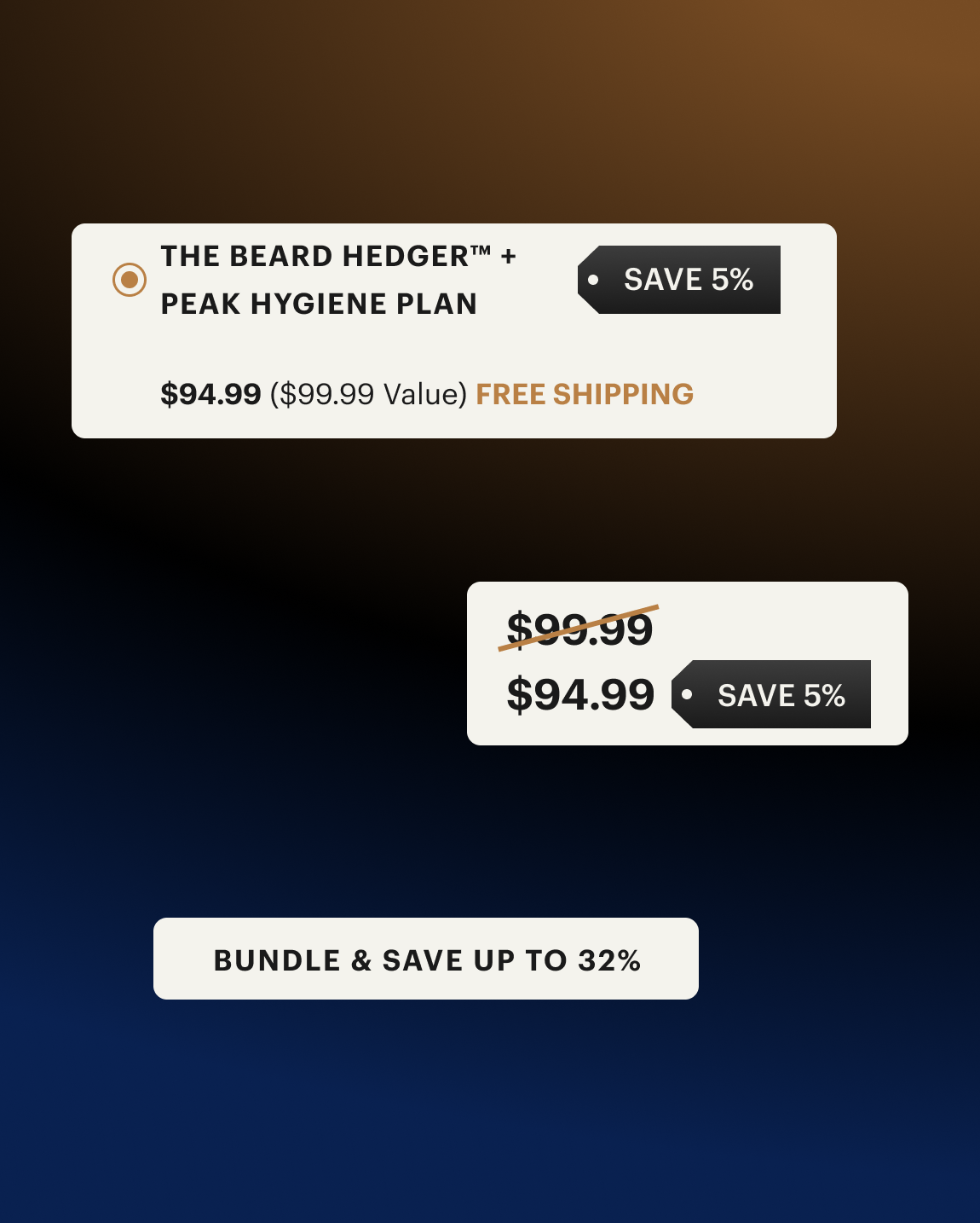
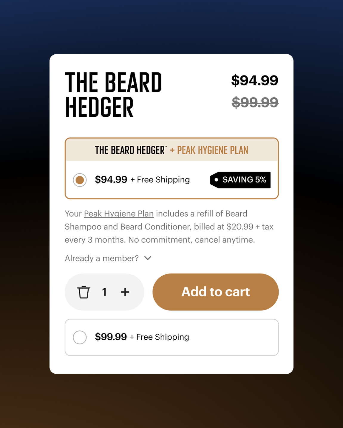
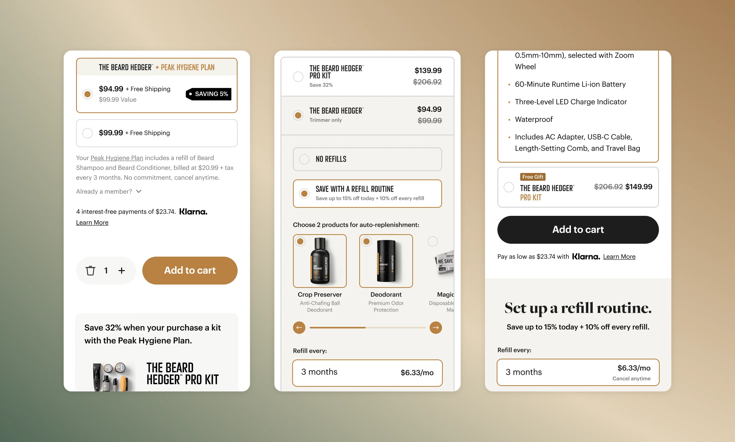
A Better Buy Box for Better Conversion Rates
After shoppers see the value in the product, the “Add to Cart” button needs to do its job effectively and efficiently. MANSCAPED offers two great ways to purchase: either buying the standalone product at full price, or set up a refill subscription and get the product at a discounted price.
There were only two options, but the layout caused confusion because it wasn’t clear why one option may be more valuable than the other. We needed to add information for clarity, but avoid adding friction.
We tested numerous options, some that were major changes and others that were small evolutions, to identify the right combination that provided the balance of clarity and simplicity.

In The End...
Listening to your customer pays off, literally.
By crafting a premium retailing atmosphere with authentic social proof and a straightforward buying experience, we turned shopper’s hesitation into desire and intent.
“This actually makes me want to buy the product due to how great the UI looks. The demonstration of the product too, it just makes me really want to buy it.”