Welcome
How We Established a Design System for an Industry Leader
What We Did
Like their business, MANSCAPED’s website had grown organically and quickly, leading to design inconsistencies that often slowed their teams and complicated development. Working closely with their internal teams, we created a comprehensive design system in Figma that cleaned up their existing components and styles, added new multipurpose components, and gave their designers and developers a single source of truth. The result? A faster, more efficient way to build and maintain their online presence.
Precision Engineering
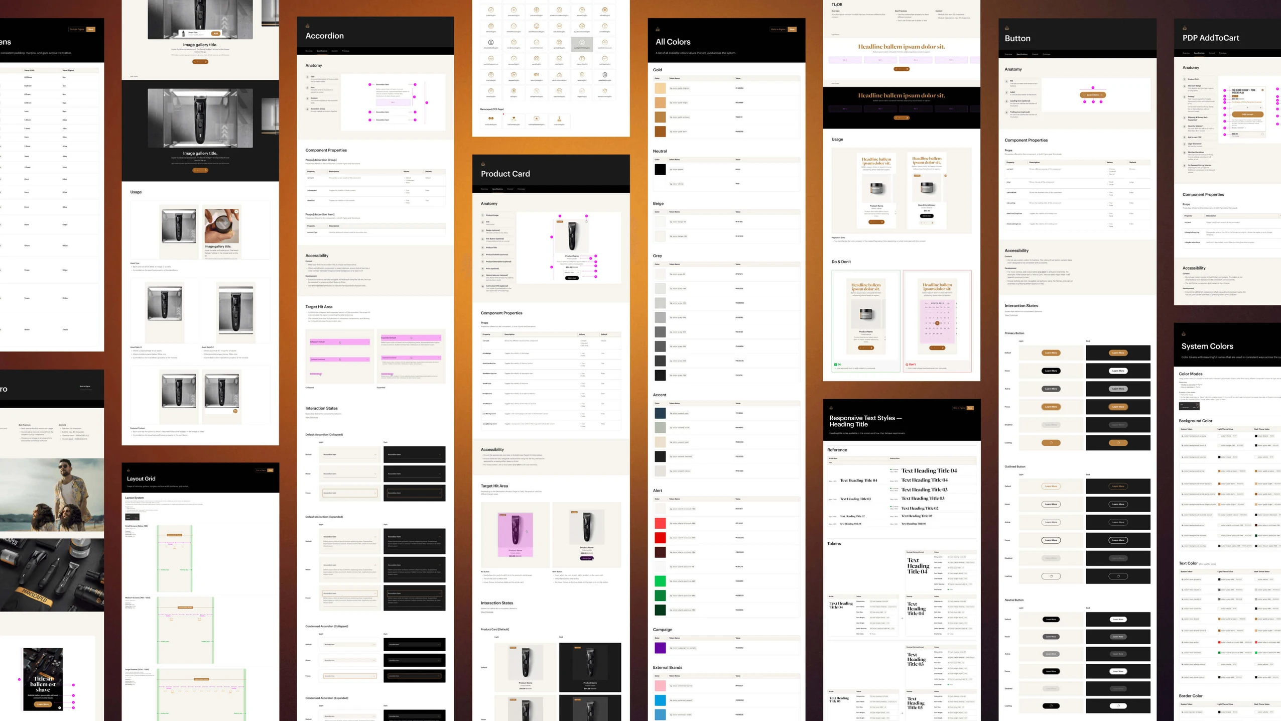
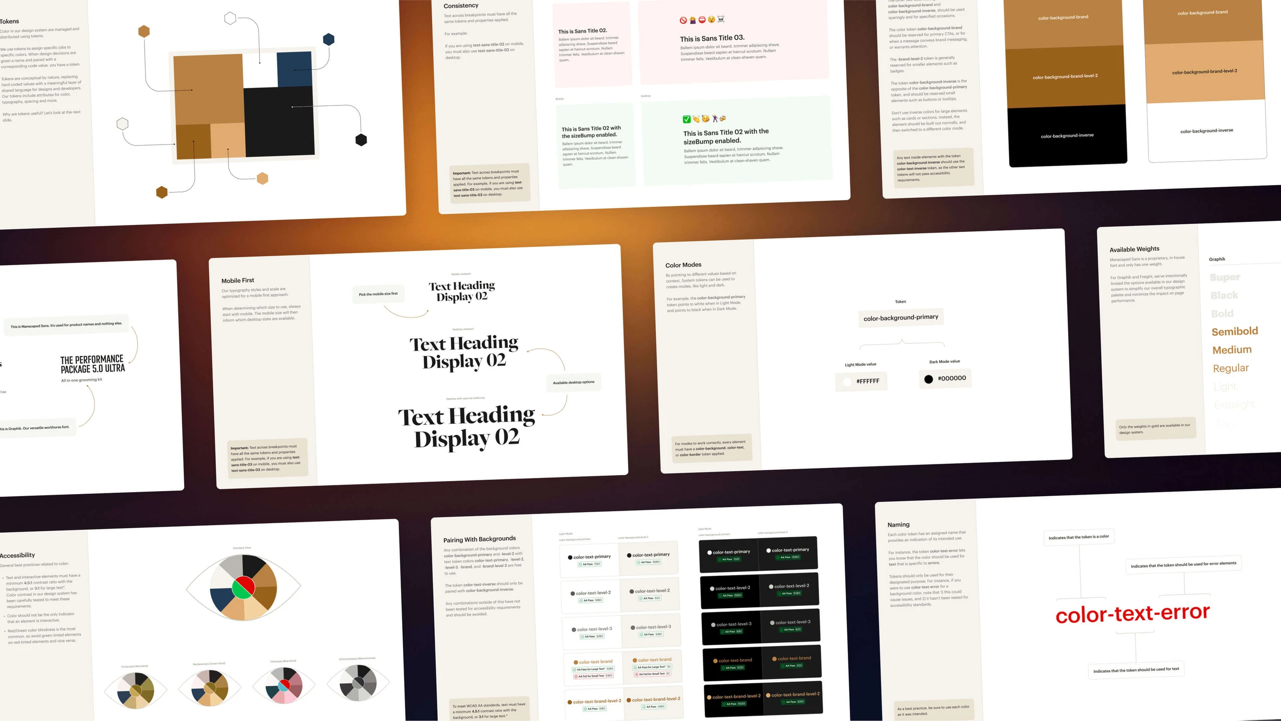
We started by conducting a comprehensive audit of MANSCAPED’s existing digital assets to identify redundancies and inconsistencies. Through collaborative sessions with their design and development teams, we streamlined their design language, removing two dozen superfluous colors from the palette, and consolidating typography styles from 56 to 32 that all scale responsively.
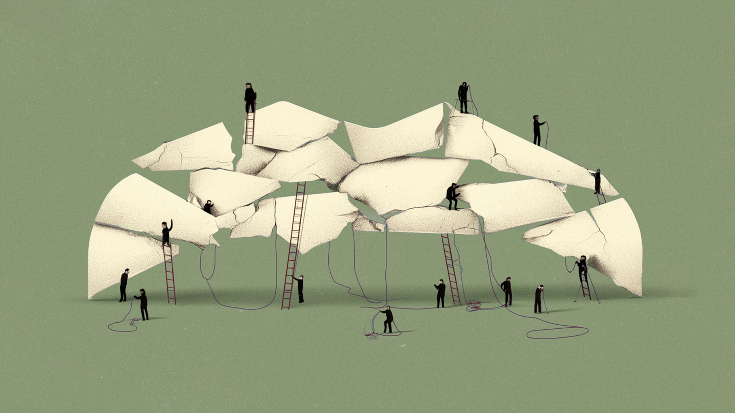
Component Consolidation
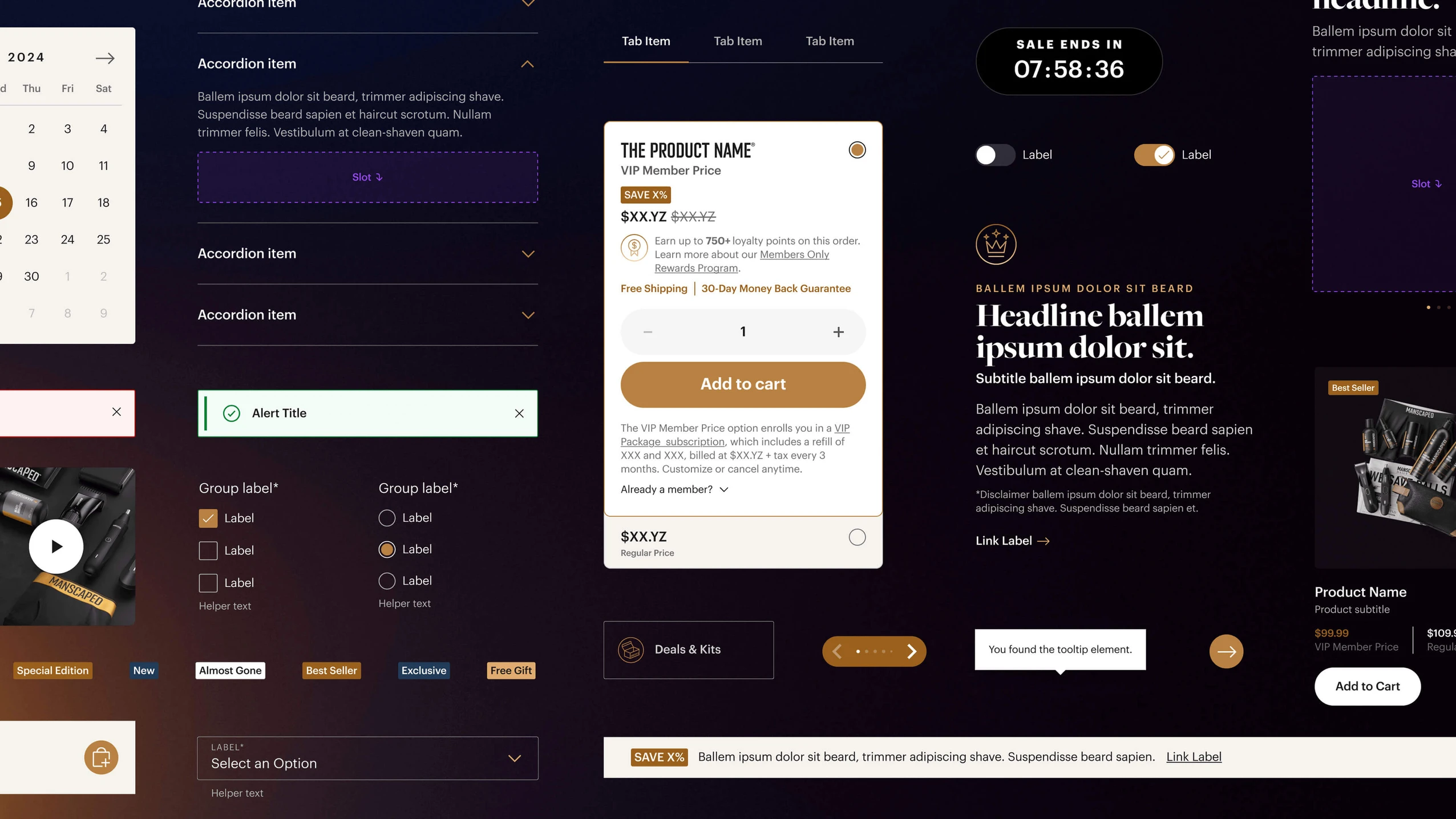
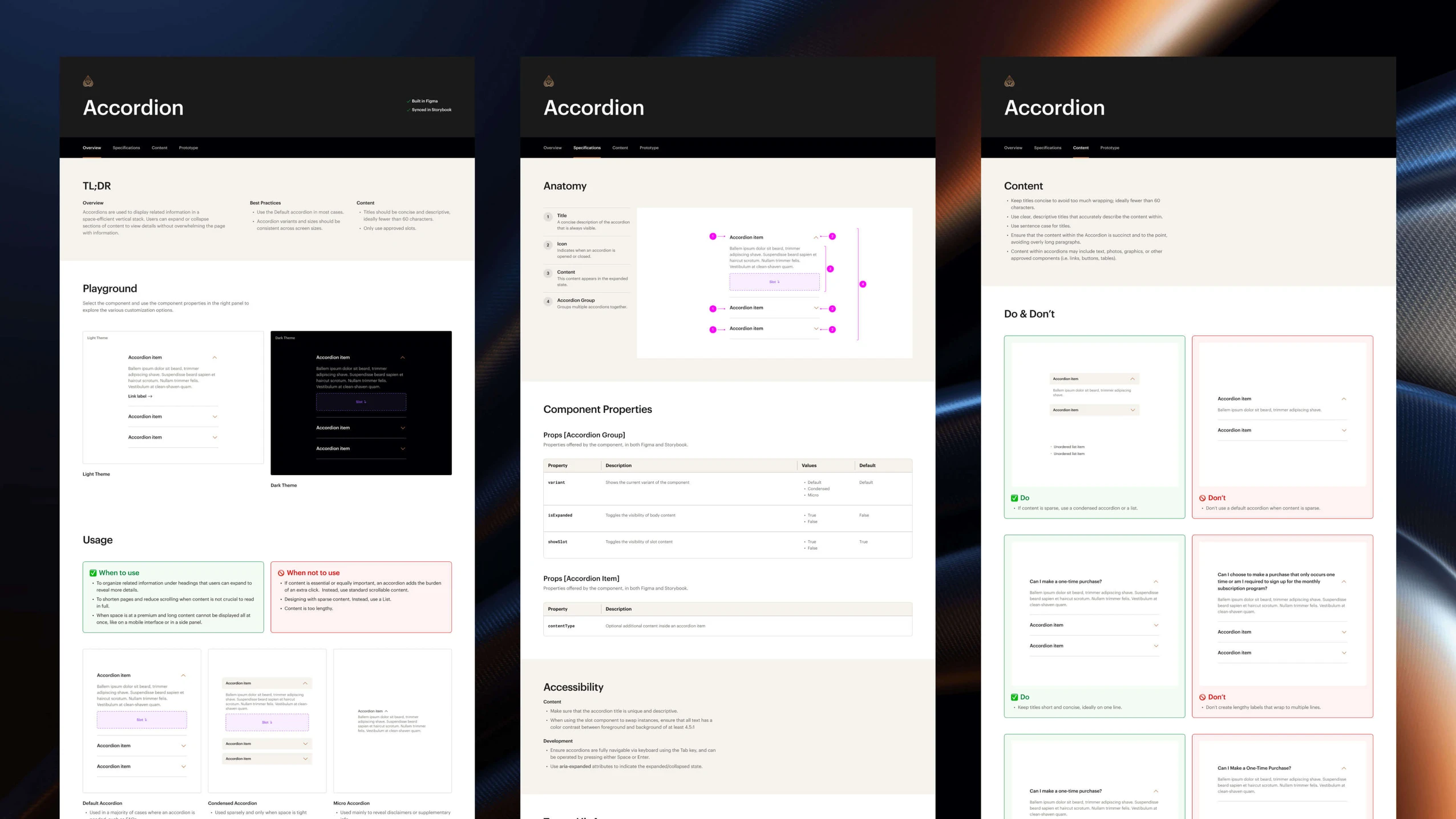
Through careful analysis and regular check-ins, we identified opportunities to merge similar components, and create new multi-purpose components. The result was a lean, efficient library of 63 reusable components, each thoughtfully documented and built for flexibility.
Giving Props
We eliminated the gap between design and development by creating a robust system of shared properties across environments. When designers customize components in Figma, developers see the same names and properties in code, creating a true 1-to-1 relationship. This shared language removes ambiguity and ensures designs are implemented as intended.
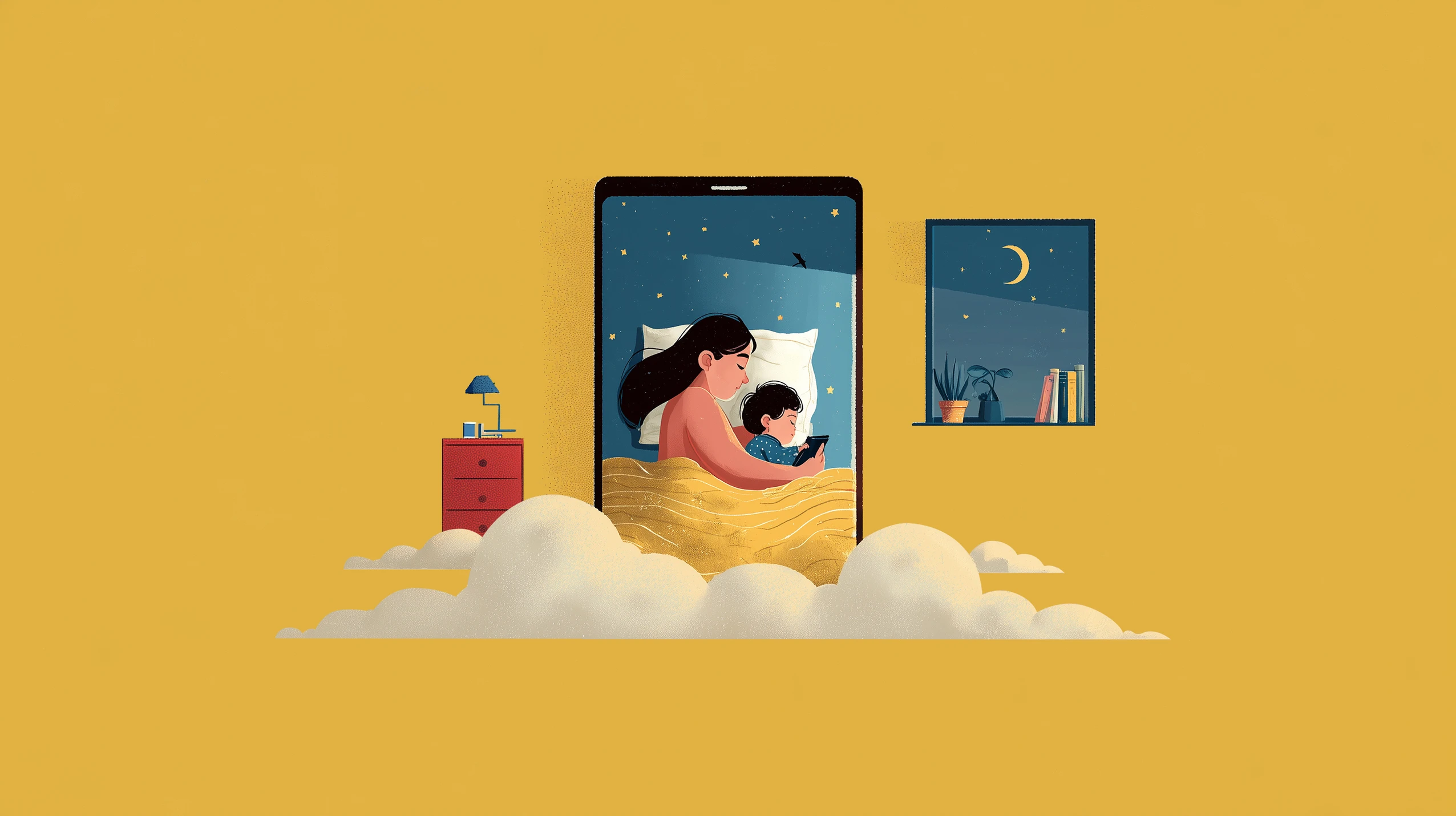
Lights On, Lights Off
Dark mode isn't just a switch—it's a complete design consideration. We created intelligent color relationships where every element knows its light and dark mode values, from subtle borders to prominent CTAs. This systematic approach means new components automatically support both modes, maintaining brand consistency while giving designers the flexibility to craft thoughtful experiences.
Documentation & Implementation
With the help of AI, we created clear, comprehensive documentation for each of the 63 components, maintaining clarity and consistency for the development, e-commerce, and content teams building with them. This includes usage guidelines and best practices that ensure consistent implementation across all new initiatives.
For a deeper dive into our process and to learn how you can spend more time designing, read our step-by-step guide on how to use AI for documentation.
“Things move fast at MANSCAPED and Five & Done keeps up no problem. Their work with our design system helped us run even more efficiently. Their team takes a collaborative, pragmatic approach without jeopardizing quality or creativity. Everybody on our team loves working with them and they always deliver. That’s why we keep working with them.”
Executive Creative Director, MANSCAPED
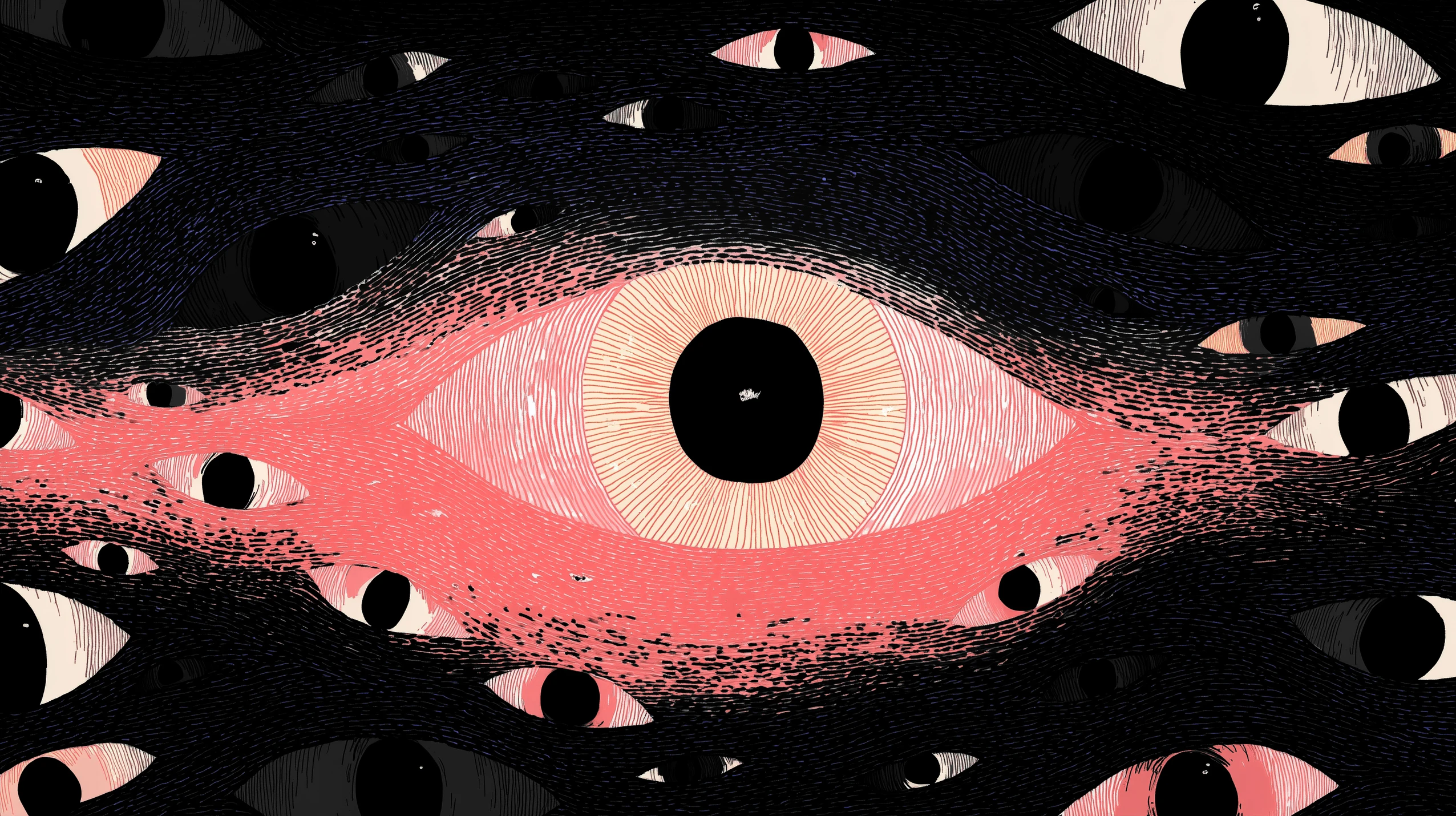
Designing for Everyone
We built accessibility into the foundation of the design system, not as an afterthought.
Global Growth
As a rapidly expanding global brand, MANSCAPED needed a system that could scale across markets and languages. We built flexibility into every component to ensure the system works worldwide, and included documentation for team members to consider how translations might impact layouts.
Universal Design
Every component was crafted to meet WCAG AA standards, with careful attention to contrast ratios that exceed requirements in both light and dark modes, scalable typography that maintains readability across all screen sizes, and clear hover and focus states for all interactive elements.

Looking Forward
This new design system isn't just about cleaning up the past—it's about enabling MANSCAPED’s future growth. With the insight of their team we established a foundation they can confidently build upon, allowing them to focus on what matters: creating exceptional products for their customers.